Apella Capital
Services
Deliverables

Brand Identity
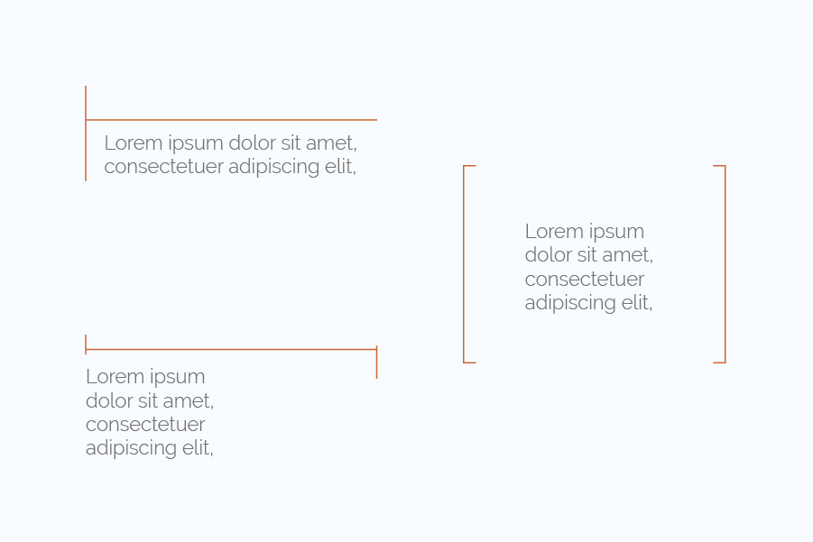
We explored concepts that integrated black and white lifestyle images with a touch of color, leading to the incorporation of the Apella orange frame. We coined the finalized image concept the "Window to the Future." The idea behind this concept was straightforward: within the orange Window of the Future, everything was vivid and bright, much like the prosperous future envisioned by Apella Capital investors. Outside the window, however, the outlook remained colorless and bleak. We complimented the photography with new branding elements, as shown below.


We’re humbled by the sentiments the Apella team expressed for the new brand identity, ranging from “Wow! This is so cool” to “This complements the Apella brand impeccably.” It’s what drives us to deliver the brand love our clients deserve.
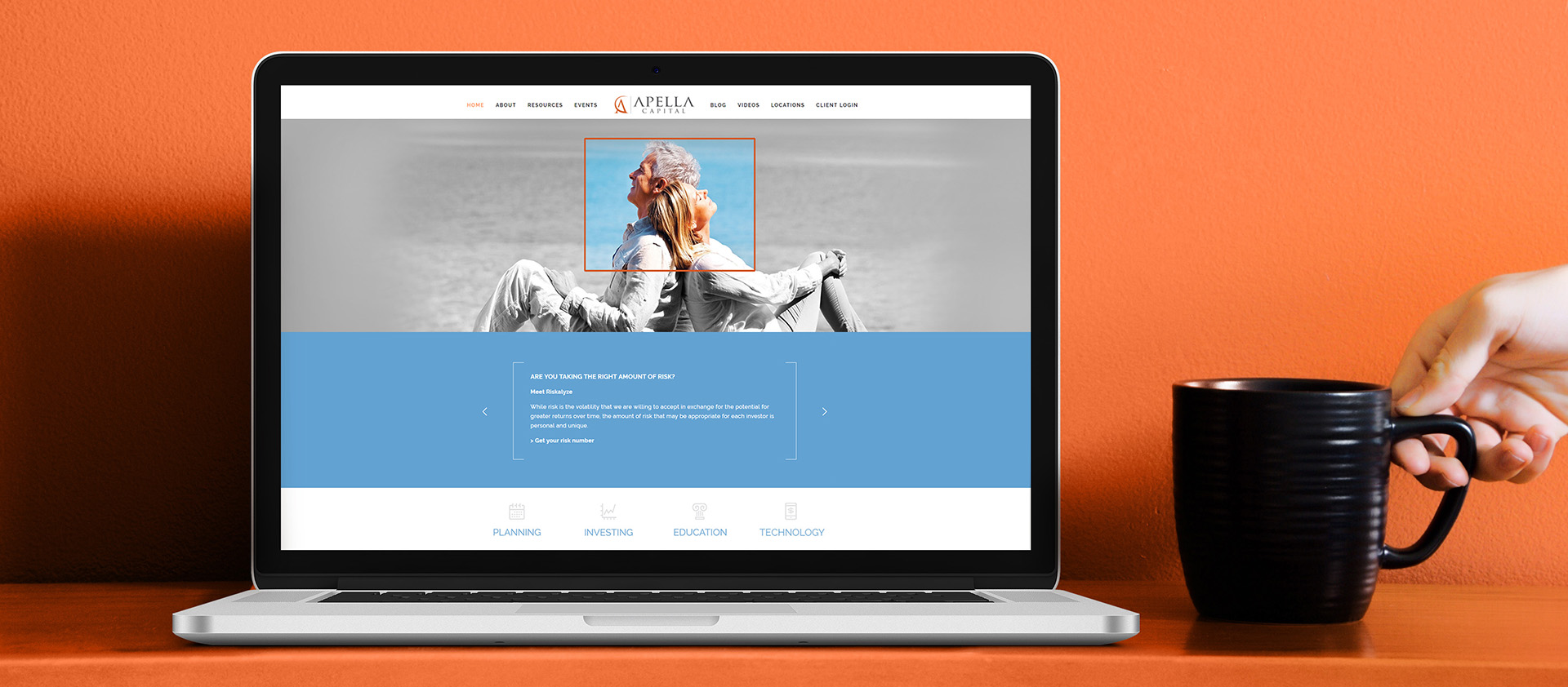
Website Design
The website served as an online brochure and was the primary extension of the brand. We rethought everything when building the site, from the structure, navigation, and visual design.
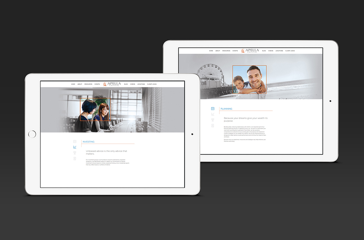
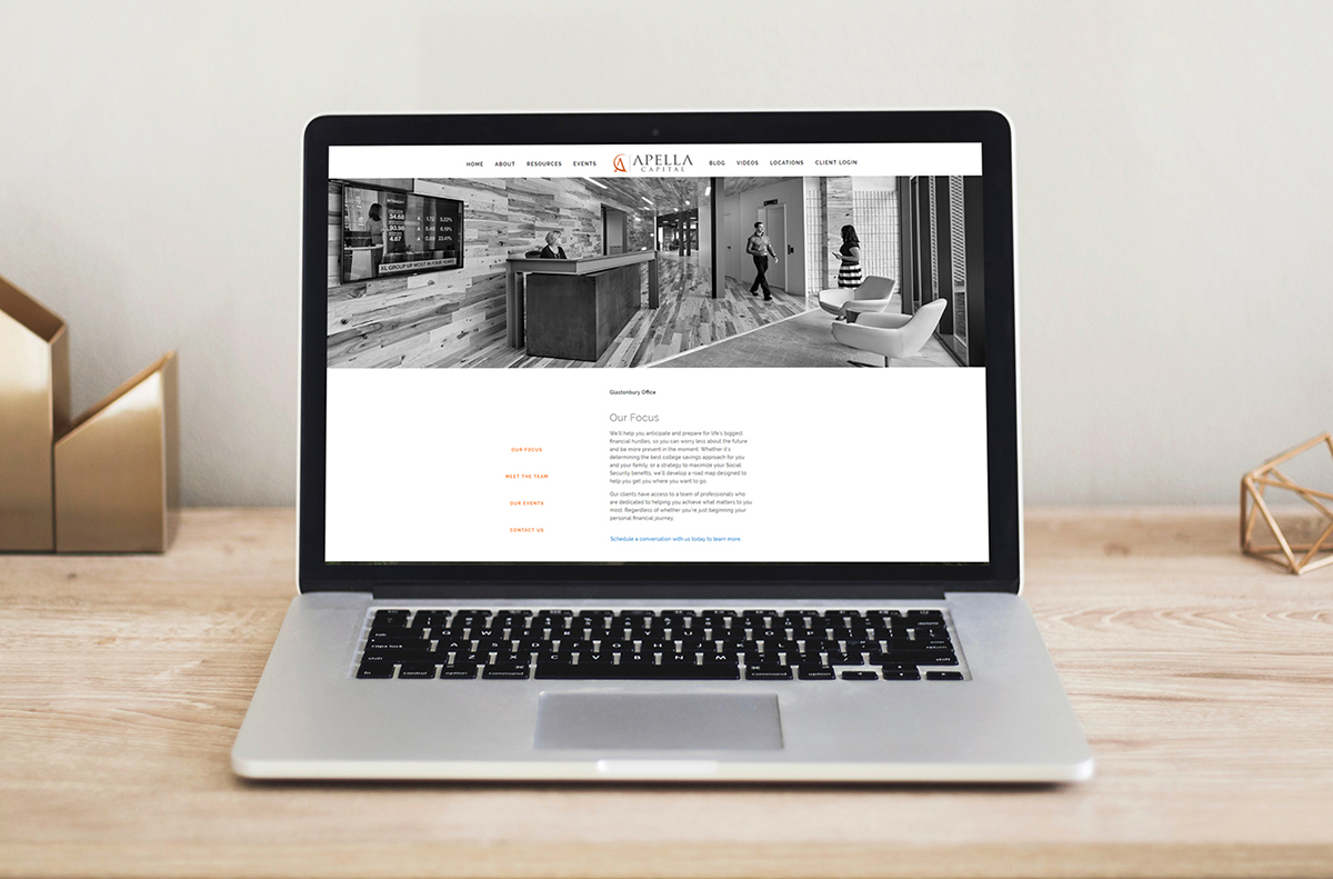
Collateral
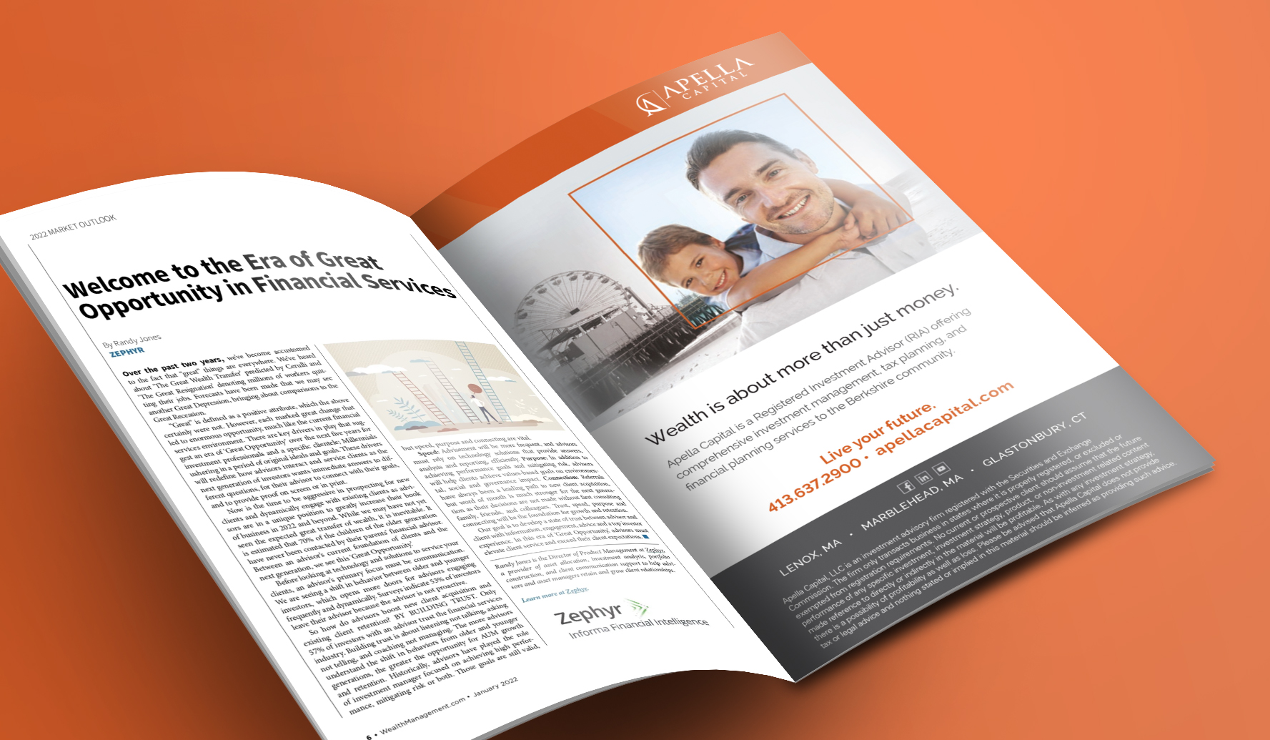
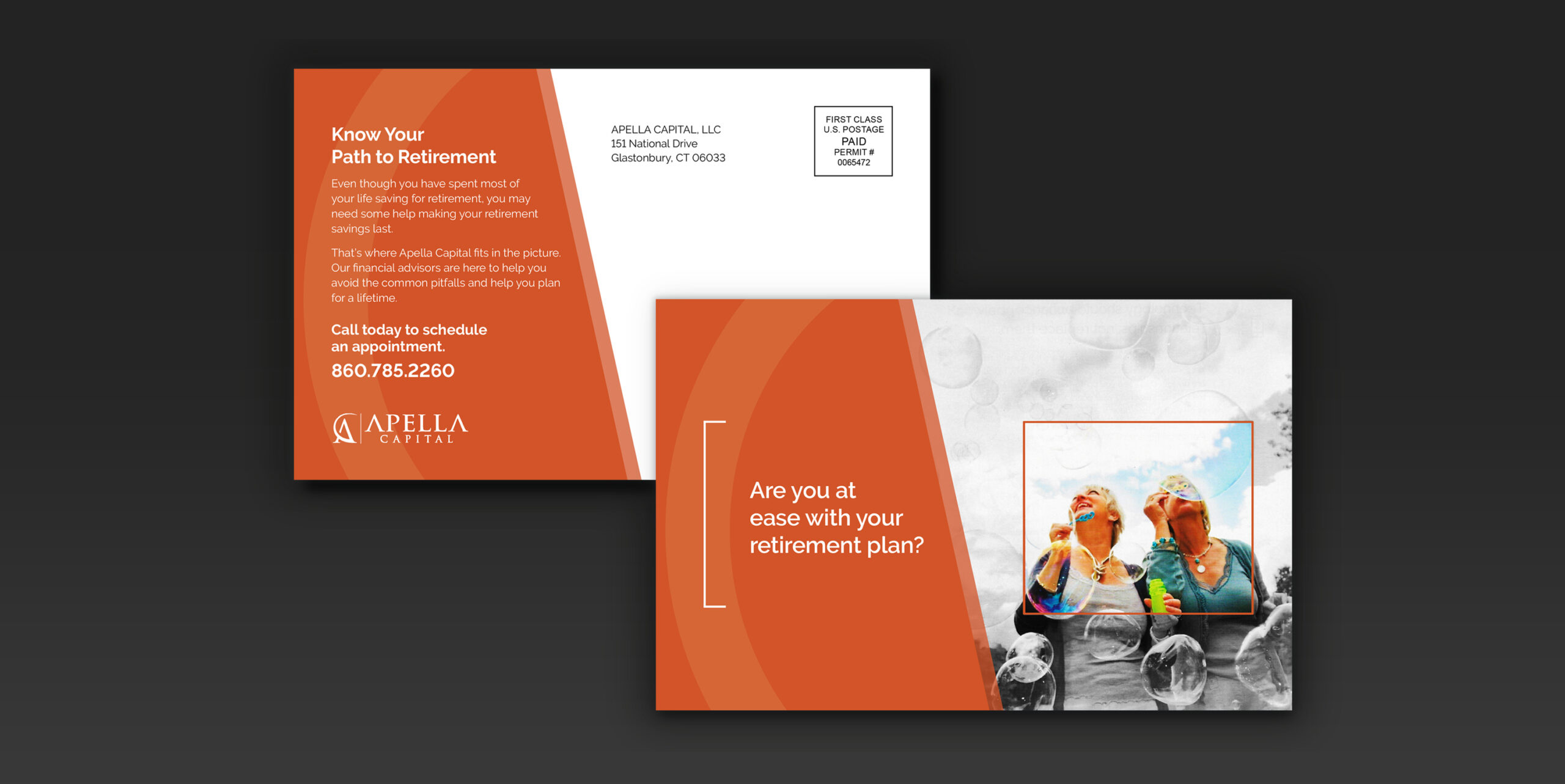
The collateral assignments included brand awareness advertising and direct mail. The primary goal of the print ad was to make prospective clients aware of Apella Capital’s existence in their local area. Meanwhile, the direct mail piece aimed to integrate with the brand’s aspirational tone, setting the stage for prospective clients to feel confident about their future. Serving as an extension of that message, it employs color, imagery, and design to reinforce the bright path that prospects can expect from their retirement when they become an Apella client.
Ready to get started?
Drop us a line and let’s discuss how we can execute a small project or develop a long-lasting partnership to elevate your brand.